How three forks on a hand-drawn chart helped a team improve

After visualising the workflow of a recent client’s software development process, and showing where the work was, the team realised there was a queue of tasks that had been developed and were waiting to be validated (‘tested’).  The team decided to move from a “I just do my task” approach to a “whole team” approach where they focussed on making a single task flow across all of the development process with minimum delay. They decided that rather than continuing to do more development and hoping that the validation work would eventually complete, the people who did development would go and help those who were validating the work.

The problem was that the Development Manager (who believed his role was to maximise the number of development tasks completed) was concerned that if the development work stopped to reduce the queue in validation, then eventually the validation step might run out of work to do.

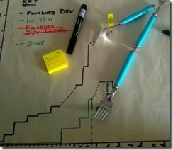
In order to address the Development Manager’s concern we went to the hand-drawn cumulative flow diagram (sometimes called a finger chart). The cumulative flow diagram was drawn each day, by the team member who ran the daily stand up, by simply counting the number of tasks in each stage of the workflow. The x-axis shows time in days, and the y-axis shows the number of tasks in each step of the workflow.

As we had a couple of weeks data it was possible to extrapolate the rate at which the validation work was being completed. We were also able to extrapolate the rate at which development work was finishing. In order to do this extrapolation we grabbed the nearest straight-edge items we could find, which turned out to be forks!

IMG_0131 

As the photo shows, the forks indicated that it would take about two weeks for the validation step to run out of work to do if most of the people doing development spent their time helping do the validation. This data allowed the Development Manager to feel more comfortable about allowing the strategy a shot for a week, after which it could be reviewed.

This example demonstrated the benefits of using quick, low-fidelity data collection methods. The discipline of hand-drawing the chart each day meant that it was better understood by the team members than if it had been automatically produced in an electronic tool.  The team were also able to see how the data could be valuable, as it allowed them to discuss the Development Manager’s concerns with data rather than just opinion.

In the end, the strategy to work as a whole team and focus on the validation step turned out very well. The team were able to reduce the time it took to validate tasks, providing quicker feedback to development (which reduced defects), increase the amount of work they got done at the same time as improving the team’s morale.

Do you have stories of using quick, low-fidelity data collection techniques to improve team performance?

by

Tags:

Comments

6 responses to “How three forks on a hand-drawn chart helped a team improve”

  1. Phil Nash Avatar

    “The discipline of hand-drawing the chart each day meant that it was better understood by the team members than if it had been automatically produced in an electronic tool”

    Why do you think this is the case? (I’m not saying its not – just that you left that as an “understood” point).

    I can think of a few reasons why it *might* be – but also some reasons why it might seem so without being the case. All conjecture, of course.

    Do you have any harder evidence? I would be very interested to hear more.

    1. benjaminmitchell Avatar

      Hi Phil,

      Thanks for your comments. You’re right that I was making a strong claim – that drawing by hand leads to more understanding than if it was automatically produced by a tool – without providing much evidence.

      My experience is that when people have to produce a cumulative flow chart by hand they confront a number of questions that highlight issues they have. My evidence for the learning is the range of questions they ask me as they are creating it for the first time – for example “do we count those things that have already been released?”. My argument is that these questions indicate they are making connections between the board and the chart that will be produced for themselves.

      Further, you can see in the photograph that there were some mistakes made where things were rubbed out and re-drawn. To me these were learning situations in that the person drew the chart, then realised they’d made a mistake (because their model of the chart didn’t include counting those things that were already completed in that stage of the workflow) and corrected it. This is consistent with Argyris’ idea that learning is the detection and correction of error. If they’d just read the output of an electronic tool I’m not sure there would have been an opportunity for them to have made this mistake and corrected their view of how to build the chart.

      On another level, it’s a lot more fun (I find) to do the work by hand (at least at first). I’d also refer to Dan Ariely’s “IKEA effect” where “labor enhances affection for its results”

      I agree with you that the link is not a definite one – people can draw things by hand and still not connect with the meaning.

      I’d also say that once people understand the way the chart is constructed and the benefits, then it can be a lot more convenient for a tool to produce it (I encourage a team to use Excel if they decide to continue to draw Cumulative Flow Diagrams)

      How’s that answer for you? Let me know if you see it differently or see any gaps or inconsistencies in my response.

      Benjamin

      1. Phil Nash Avatar

        Awesome response. Thanks Ben. I think I pretty much agree with all your reasoning. I’m particularly glad you added at the end that a tool may be useful after the first few iterations.

        I’m glad you took the time to expound your view – it was a bit too glossed over in the original post. Perhaps material for a later full post, perhaps? 😉

  2. Phil Nash Avatar

    I should add, I did like the story 🙂

    “May the forks be with you!”

    Ahem.

  3. Russell Geake Avatar
    Russell Geake

    Clearly, working with talented and creative teams that are keen to improve their effectiveness (mentioning no names) helps. BTW drawing this chart was a lot of fun – I’m just glad we grabbed the forks BEFORE the pasties arrived!

    FROM FORKS TO FORMULAS

    We swiftly progressed to Excel-based charting and I’ve developed some nice dashboards – including trendlines, forecasts and optional scenarios, which means we can simulate outputs before we put in any significant effort…we can then choose the actions which will create the best output.

    e.g. our Commitment/Achievement chart, simply takes the number of commitments and the number of commitments acheived during each sprint…you can ID whether you are over committing, under-achieving or not stretching the team far enough… we identified that we consistently over committed during several of our one week sprints, but somehow it when we committed to twice as much output over 2 week sprints we achieved. “Engineering” our commitments to make a positive gradient improves morale and a foundation for further stretching.

    Thanks for your help in getting the organisation kick-started with Agile. We are continuing to improve!

  4. allan kelly Avatar

    To Phil’s point I am reminded of an interview I read with Jack Kilby, the inventor of the integrated circuit and pocket calculator. Kilby said he lamented the passing of the slide rule because engineers had to use their own intuition to know where to put the decimal point. With calculators engineers didn’t need to think at all so didn’t develop an intuitive feel for whats going on.

    We are surrounded by electronic tools today that tell us so much automatically, personally a lot of it goes in one eye and out the other. When you have to get physical and thoughtful it is sinks in, you reflect a little bit.

    This is one of the reasons I always advise teams to start with physical card and whiteboards and only look at online tools when they have some experience.

    As Gibson wrote in Jonny Mnemonic: “If they think you’re crude, go technical; if they think you’re technical, go crude”

    To Russell’s point, I’m reminded of famous quote “It is better to be roughly right than precisely wrong” – which Wikiquote tells me was note Keynes but Carveth Read, someone far less famous.

    I have encouraged teams to product CfD or burn-downs and forcaste the end date by lying a ruler on it. Again, Excel quickly takes over, it has lots of fancy functions for extrapolating data, you can produce any date you like.

    My advice is: Keep it Simple, the more allowances and adjustments you make the more difficult it is to comprehend what you have.

Leave a Reply

Your email address will not be published. Required fields are marked *